How Do You Adapt a Ready Website Design to Your Brand?
A ready website design is adapted to your brand by applying your colors, fonts, logo, images and copy, adjusting the layout where needed and adding the sections you require. Done well, the result is not a site that looks like a template but one that clearly carries your brand. In this guide we walk through the steps of adaptation, what can be changed and the preparation that speeds everything up.
What is design adaptation?
Design adaptation means reworking a website design that has already been planned and tested so that it fits your brand. It aims for the same result as a custom design: a site that builds trust, is easy to navigate and brings in enquiries. The difference is the starting point. Instead of a blank page, you begin with a proven page structure.
The biggest advantage of this approach is less uncertainty. You see the design in a live preview from the very start. The question "what will it look like in the end?" is answered in the first conversation.
Ready design versus a downloaded template
Many people assume a ready design is the same as a theme downloaded from the internet. In practice they do different jobs.
| Topic | Downloaded theme | Ready design adapted to your brand |
|---|---|---|
| Look | Often used as it is | Colors, fonts and visual language change to match the brand |
| Content | Sample text is swapped for your text | Page order and sections are planned around your business |
| Management | Depends on plugins and settings | Content is edited from a management panel |
| Support | Usually you are on your own | The process moves with your approval and includes a demo before launch |
What can be changed during adaptation?
The limit of adaptation is the skeleton of the design. As long as the skeleton stays, almost everything else can change.
- Color palette: Your brand colors are applied to buttons, headings and backgrounds.
- Fonts: Your brand font, or the closest match, is used.
- Logo and images: Your own photos, product images and team pictures replace the samples.
- Copy: Headings, service descriptions and calls to action are written in your voice.
- Sections: References, team, gallery, blog, FAQ or a quote form can be added or removed.
- Menu and page order: Arranged around what visitors need to see first.
If you want to change the overall concept of the design completely, custom design from scratch is the better route.
The adaptation process step by step
1. Choosing the right design
You start by choosing the design closest to your industry. Do not look only at the colors; focus on the page structure. Can you explain each service on its own page? Is there room for your team, references or a gallery? Colors can change later, while the structure is the backbone of the site.
2. Agreeing on the scope
Next, you decide which pages the site will have, which sections will be added and how many languages it will publish in. These details go into a written quote, so you know exactly what is included from the start.
3. Applying your brand identity
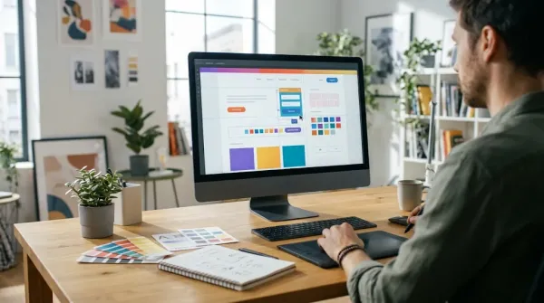
Colors, fonts and the logo are applied to the design. Small touches make a big difference here. A button color that matches your main brand color, for example, is what makes the site feel like yours.
4. Placing the content
Text and images are added to the relevant sections. In a good adaptation, content is not squeezed into the design; the design is adjusted to the content. If one of your services needs a longer explanation, a suitable page structure is built for it.
5. Checking in a demo environment
Before launch, the site is reviewed in a demo environment. You check it on a computer, a phone and a tablet, test the forms and read the copy one last time. Nothing goes live without your approval.
6. Launch and management
After approval, the site goes live on your own domain. From then on, you update the content yourself from the management panel. Adding a new service or changing a photo does not mean waiting for anyone.
Preparation that speeds things up
How smoothly adaptation goes depends largely on preparation. Gathering these materials early makes the work easier:
- A vector or high-resolution logo
- Brand color codes and the font you use
- A list of your services or products, with a short description for each
- Photos of your team, office and work
- Companies you can show as references and customer testimonials
- Phone, email, address and social media details
If your copy is not ready, do not worry. But a two or three sentence draft for each service keeps the process from stalling.
Search visibility during adaptation
A beautiful site is useless if nobody can find it, so search engines need attention during adaptation too. The good news is that a ready design built on a solid platform already has the core technical settings in place. Your part is to structure the content well.
- A page for every service: Give each service its own page instead of listing them all on one. Each service then becomes a separate entry point in search.
- Descriptive titles: Use the words customers actually search for. "Corporate Accounting Consultancy" says far more than "Our Services".
- Page descriptions: Write a short, inviting description for each page that will appear in search results.
- Image alt text: Add short descriptions of what each photo shows.
- Speed: Converting images to lightweight formats keeps pages fast on phones as well.
Details that increase conversions
What turns a visitor into a customer is often a set of small details. Paying attention to these during adaptation helps the site bring in more enquiries:
- The first screen of the homepage should explain what you do in one sentence.
- Phone and WhatsApp buttons should be easy to find on every page.
- Testimonials and references should sit close to the quote button.
- Forms should be short and ask only for what is truly needed.
- The FAQ should answer the objections visitors already have in mind.
Most of these details are already considered in ready designs. What adaptation needs to do is fill them with the right content for your business.
Common mistakes during adaptation
- Choosing a design only by its colors: Colors change, structure does not. Look at the layout.
- Trying to fill every section: Unnecessary sections clutter the page. Remove what you do not need.
- Leaving sample text in place: Generic phrases do not build trust. Describe your work in your own words.
- Skipping the mobile check: Many visitors arrive on a phone. Always check the demo on one.
- Forgetting calls to action: Visitors should know what to do next. A "Get a quote" or "Free consultation" button should be visible on every page.
Who is design adaptation for?
It is ideal for businesses that need a professional site quickly. New companies, local service businesses, clinics, law firms, consultancies and construction firms save time this way because the page structures they need already exist. Store designs built for selling can be adapted too.
Frequently asked questions
Will the adapted site look the same as other sites?
No. Colors, fonts, images, copy and, where needed, the layout change, so the result is unique to your brand.
Should I choose adaptation or custom design?
If there is a design that suits your industry and you want to move quickly, adaptation is enough. If you want a completely original visual language or an unusual page flow, custom design is the better choice.
Can I make changes after launch?
Yes. You can change text, images, pages and menus yourself from the management panel.
Conclusion
Done well, design adaptation combines speed with a personal result. The key is to choose a structure that suits your industry, apply your brand identity consistently and review the site carefully in a demo before launch. To browse the designs and pick the one closest to your brand, take a look at our Design Adaptation solution, or write to us for a written quote based on your scope.